Previous Page Table of Contents Index Next Page

Palm OS SDK Reference


Palm Logo 2 Palm OS Resources

Palm OS® User Interface resources are the elements of an application's GUI (graphical user interface). This chapter provides reference material you can use when creating user interface resources in Metrowerks Constructor. It provides detailed guidelines for using each resource, and it provides descriptions of the attributes you set in Metrowerks Constructor.


NOTE: For more information see the following manuals:
The Palm OS Tutorial provides more detailed instruction on how to create a GUI using the Constructor tool.
The Constructor for Palm OS manual in the CodeWarrior Documentation folder provides detailed reference-style documentation as well as information on how to use each individual resource.


System Resources

Every application running under Palm OS must have certain minimum system (not UI) resources defined to be recognized by the Palm OS system software. These required resources are created for your application by the development environment. You may find that you need additional, application-specific resources. The required resources are 'code' #1, 'code' #0, and 'data' #0. All other system resources are optional. This section describes both the required and optional resources.

The `code' #1 Resource

The system creates a 'code' #1 resource for every application. This resource is the entry point for the application and is where application initialization is performed. When the Palm OS device launches an application, it starts executing at the first byte of the `code' #1 resource. All of the application code that you provide is included in this resource as well.

Typically, some startup code provided with the Palm OS development environment is linked in with your application code. This startup code works as follows:

The `code' #0 and `data' #0 Resources

The 'code' #0 and 'data' #0 resources contain the required size of your global data and an image of the initialized area of that global data. When your application is launched, the system allocates a memory chunk in the dynamic heap that's big enough to hold all your globals. The 'data' #0 resource is then used to initialize those globals.

The `pref' #0 Resource

The system creates a'pref' #0 resource for every application. This resource contains startup information for launching your application. The resource includes

This resource applies only to Palm OS 3.0 and higher. It is ignored on older versions of Palm OS.

Resource Types

Metrowerks Constructor divides resources into two types: catalog resources and project resources.

Catalog Resources

Catalog resources are available in Constructor's Catalog window and can be dragged directly on a form. Table 2.1 lists the available catalog resources. The Macintosh ResEdit resource name is included for reference only; it's not needed by developers who use Constructor exclusively, and not relevant for Windows developers.

Table 2.1 Catalog Resources 

Name Resource Resource
tBTN Button Resource
tCBX Check Box Resource
tFLD Field Resource
tFBM Form Bitmap Resource (container for Bitmap resource)
tGDT Gadget Resource (application defined)
tGSI Graffiti Shift Indicator Resource
tLBL Label Resource (container for a String)
tLST List Resource
tPUT Popup Trigger Resource
tPBN Push Button Resource
tREP Repeating Button Resource
Scroll Bar Resource (see below)
tSLT Selector Trigger Resource
tTBL Table Resource

Project Resources

Project resources are instantiated from the projects window.

Table 2.2 lists the project resources. The Macintosh ResEdit resource name is included for reference only; it's not needed by developers who use Constructor exclusively, and not relevant for Windows developers.

Table 2.2 Project Resources 

Name Resource UI Name
Talt Alert Resource Alert
tFRM Form Resource Form
Menu Resource Menu
Menu bar Resource Menu bar
tSTR

String Resource

String

Icons

Bitmaps

Alert Resource

Example

Overview

The alert resource defines a modal dialog that displays a message, an icon, and one or more buttons.

A small icon indicates the category of the dialog box; for example, an exclamation mark for an error message. The icon appears on the left side of the dialog. The text is justified left but placed to the right of the dialog icon.

Type Icon Definition Button Example
Information i Lowest-level warning. Action shouldn't or can't be completed but doesn't generate an error or risk data loss. OK An alarm setting must be between 1 and 99.
Confirmation ? Confirm an action or suggest options. OK,
Cancel
Change settings before switching applications? (For example, when pressing an application key with an open dialog box.)
Warning ! Ask if user wishes to continue a potentially dangerous action. OK,
Cancel
Are you sure you want to delete this entry?
Error (stop sign) Attempted action generated error and/or cannot be completed. OK Disk full.

The Alert resource has the following attributes.

Attributes

Alert Type Determines the sound played and the icon displayed when the alert is drawn. There are four possible icons:

  • InformationAlert (Alert Number 0)

  • ConfirmationAlert (Alert Number 1)

  • WarningAlert (Alert Number 2)

  • ErrorAlert (Alert Number 3)
Help ID The ID of a String resource that's the help text for the alert dialog box. If you provide a value, the system displays an "i" in the top right corner of the alert box.
Default Button ID The number of a button that the system assumes is selected if the user switches to another application, forcing the form to go away without making a selection.
Title Title of the alert form.
Message Message displayed by the alert dialog. May contain ^1, ^2, ^3 as substitution variables for use in conjunction with FrmCustomAlert.
Button Text Text of the button (e.g. OK or Cancel), determined by an entry in the resource of each button.
To add a button, select Item Text 0, and type Cmd-K.

Button Resource

UI Structure

ControlType

Overview

A button is a clickable UI object, often used to trigger events in an application. A button displays as a text label surrounded by a rectangular frame. The frame has rounded corners. The label may be regular text or a glyph from one of the symbol fonts provided with your development environment, for example, an arrow.

Examples

Attributes

Object Identifier Name of the object. Assigned by developer and used by Constructor during header file generation and update.
Button ID ID of the object (assigned by Constructor).
Left Origin Form-relative position of left side of button. Valid values: 0 - 159
Top Origin Form-relative position of top of object. Valid values: 0 - 159
Width Width of button in pixels. Size the buttons to allow 3-6 pixels of white space at each end of the label. Valid values: 0 - 160
Height Height of the button in pixels. Should be 3 pixels larger than the font size, for example, height =12 for 9-point labels. Valid values: 1 - 160
Usable A nonusable object is not considered part of the application's interface and doesn't draw. Nonusable object can programmatically be set to usable. If checked, the object is usable.
Anchor Left Controls how the object resizes itself when its text label is changed. If checked, the left bound of the object is fixed; if unchecked, the right bound is fixed.
Frame If checked, a rectangular frame with rounded corners is drawn around the button. Most buttons have frames. Buttons whose labels are single symbol characters such as scroll buttons don't have frames.
Non-bold Frame If checked, a one-pixel-wide rectangular frame with rounded corners is drawn around the button. If unchecked, a bold frame (two pixels wide) is drawn around the button. Non-bold frames are the default.
Font Font used to draw the text label of the button. Choose from the pop-up menu to select one of the fonts.
Label Text displayed inside the button: one line of text or a single character from a symbol font to create an increment arrow.

Comments

The label is centered in the button. If the label text is wider than the button, the whole label is centered and both the right and left sides are clipped.

Place command buttons at the bottom of table views and dialog boxes. Leave three pixels between the dialog bottom and buttons.

Increment arrows are a special case; they are buttons that let users increment the value displayed in a data field.

To create an increment arrow, use an arrow character from the Symbol font as a label. Several arrow styles and sizes are available.

Tip

Making a Button with a Bitmap Label

It's not possible to make a bitmap the label of a button; the label always has to be a text string. However, the same effect can be achieved by

Make sure the bitmap is a Form Bitmap, selected from the catalog.

When the user selects the button, the system inverts the bitmap graphic as well.

Check Box Resource

UI Structure

ControlType

Overview

A check box is a small, square UI object with an optional text label to the right.

Example

The figure below shows a checked and an unchecked check box with a label to the right (the default).

Attributes

Object
Identifier
Name of the object. Assigned by developer and used by Constructor during header file generation and update.
Check Box ID ID of the object (assigned by Constructor).
Left Origin Form-relative position of left side of object. Valid values: 0 - 159
Top Origin Form-relative position of top of object. Valid values: 0 - 159
Width Width of the picking area around the check box. Valid values: 0 - 160
Height Height of the picking area around the check box. Valid values: 1- 160
Usable If this box is checked, the object is usable. A nonusable object is not considered part of the application interface and doesn't draw. Nonusable objects can programmatically be set to usable.
Selected Initial selection state of the checkbox. If the box is checked (the default), the checkbox is initially checked.
Group ID Group ID of a check box that is part of an exclusive group. Ungrouped (nonexclusive) check boxes have 0 as a group ID. Valid values: 0 - 65535
Font Font used to draw the text label of the button. Choose from the pop-up menu to select one of the fonts.
Label Text displayed to the right of the check box. This text is part of the activation area. To create a (nonactive) label to the left of the check box, leave this attribute blank and create a separate Label resource.

Comments

Make sure that only one check box in a group is initially checked.

All check boxes are the same size. The Height and Width determine the toggle area, which is the screen area the user needs to press to check or uncheck the box.

If a label attribute is defined, it's part of the activation area.

Field Resource

UI Structure

FieldType

Overview

The field UI object is for user data entry in an application. It displays one or more lines of text. A field can be underlined, justified left or right, and editable or uneditable.

Text fields can be located anywhere except in menus and in the command button area.

The following is an underlined, left-justified field containing data:

Attributes

Object
Identifier
Name of the object. Assigned by developer and used by Constructor during header file generation and update.
Field ID ID of the object (assigned by Constructor).
Left Origin Form-relative position of left side of object. Valid values: 0 - 159
Top Origin Form-relative position of top of object. Valid values: 0 - 159
Width Width of the object in pixels. Valid values: 0 - 160
Height Height of the object in pixels. Valid values: 1- 160
Usable If this box is checked, the object is usable. A nonusable object is not considered part of the application interface and doesn't draw. Nonusable objects can programmatically be set to usable.
Editable If this box is checked, the field is editable. Noneditable fields don't accept user input but can be changed programmatically. Noneditable text fields are useful when you want to display text on a form but don't want users to edit it.
Underline If set, each line of text is underlined with a gray line.
Single Line If checked, the field doesn't scroll horizontally and doesn't accept Return or Tab characters. Only a single line of text is displayed. If the user attempts to enter text beyond this, the system beeps. Multiline text fields expand. An empty field may display one or more blank lines; for example, records in a To Do list or a text page.
Dynamic Size If checked, the height of the field is expanded or compressed as characters are added or removed. Set this attribute to false if the Single Line attribute is set.
Left Justified Text justification. Supported only for fields that have the Single Line attribute checked. Valid values: checked (left-justified)--recommended unchecked (right-justified)
Max characters Maximum number of characters the field accepts. This is a limit on the number of characters a user can enter, but not on what can be displayed. All fields can display up to 32,767 characters regardless of this setting. Valid values: 0 - 32767
Font Font used to draw the text label of the button. Choose from the pop-up menu to select one of the fonts.
Auto-Shift

If checked, 2.0 (and later) auto-shift rules are applied.
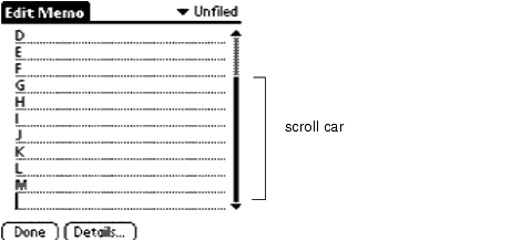
Has Scrollbar If checked, the field has a scroll bar. The system sends more frequent fldHeightChangedEvents so the application can adjust the height appropriately.
Numeric If checked, only the characters 0 through 9 are allowed to be entered in the field.

Form Resource

Overview

A form is a container for one or more of the Catalog Resources.

Applications usually contain several different forms that the user triggers by tapping buttons or other control UI objects. Most UI objects are displayed only if they are contained within a form.

Example

The example below shows a modal form. A form can also be as large as the screen.

Attributes

Left Origin Window-relative position of left side of form. Valid values: 0 - 159
Top Origin Window-relative position of top of form. Valid values: 0 - 159
Width Width of the form in pixels. Valid values: 0 - 160
Height Height of the form in pixels. Valid values: 1- 160
Usable Not currently supported for forms.
Modal If checked, form is modal. Modal forms ignore pen events outside their boundaries. Used for dialogs.
Save Behind If checked, the region obscured by the form is saved when it's drawn and restored when it's erased. Used for dialogs.
Form ID Form ID assigned by Constructor.
Help ID ID number of a string that's displayed when the user taps the "i" icon. The system adds the icon to the form when you provide a value for this property. Currently, only modal dialogs have help resources.
Menu Bar ID Contains the ID of a menu bar resource to be associated with this form.
Default Button ID ID number of a button that the system assumes is selected if the user switches to another application, forcing the form to go away without making a selection.
Form Title Title of that form. Use titles for dialogs, menu bars for views. By convention, the name of the application and the name of the screen, if possible, for example Address List or Address Edit. The title must be one line; it uses about 13 pixels of the top of the form.
Palm OS Version Version of the device for which this form is created.

Comments

The total display on the Palm device is 160 pixels by 160 pixels. If you want your whole form to be seen, make sure it fits within this display area. For pop-up dialogs, you can make the form smaller. Align a popup dialog with the bottom of the screen.

Here are some general design guidelines:

  • Each form should have a title that displays the name or view of the application, or both.

  • Scroll bars in fields and tables appear and disappear dynamically if you've selected that option for that UI element. Place them to the right of command buttons.

  • Modal dialogs always occupy the full width of the screen and are justified to the bottom of the screen. They hide the command buttons of the base application but don't obscure the title bar of the base application if possible. There should be a minimum of three pixels between the top of the modal dialog title bar and the bottom of the application title bar. If the dialog is too large to accommodate this, the entire application title bar should be obscured.

  • Screen command buttons should always be at the bottom of the screen.

  • Dialog command buttons appear four pixels above the bottom of the dialog box frame. Two-pixel default ring is three pixels above the bottom, and the baseline of the text within the buttons should be aligned.

  • Command buttons should be centered so that the spaces between the buttons are twice the width of the spaces between the edges and the border (see diagram below).

    If possible, all buttons should be the same width. At a minimum, they should be spaced equidistant, as illustrated below.

Form Bitmap Resource

Overview

Places predefined bitmaps on a given form. Used for icons in Alert dialogs to indicate a warning, error, information, and so on. You have to associate a Bitmap with the Form Bitmap to actually make a picture appear.

Attributes

Object
Identifier
Name of the object. Assigned by developer and used by Constructor during header file generation and update.
Left Origin. Left bounds of bitmap.
Top Origin Top bounds of bitmap.
Bitmap Resource ID ID of a PICT resource containing the graphic. You can also assign an ID number, then click on Create and draw the picture in the bitmap editor that appears.
Usable Checked if the bitmap should be drawn.

Gadget Resource

Name

tGDT

UI Name

Gadget

Overview

A gadget object lets developers implement a custom UI gadget. The gadget resource contains basic information about the custom gadget, which is useful to the gadget writer for drawing and processing user input.

Attributes

Object
Identifier
Name of the object. Assigned by developer and used by Constructor during header file generation and update.
Gadget ID ID of the object (assigned by Constructor).
Left Origin Form-relative position of left side of object. Valid values: 0 - 159
Top Origin Form-relative position of top of object. Valid values: 0 - 159
Width Width of the gadget in pixels. Valid values: 0 - 160
Height Height of the gadget in pixels. Valid values: 1- 160
Usable If this box is checked, the object is usable. A nonusable object is not considered part of the application interface and doesn't draw. Nonusable objects can programmatically be set to usable.

Graffiti Shift Indicator Resource

Overview

The Graffiti® Shift Indicator resource specifies the window-relative or form-relative position of the Graffiti shift state indicator. The different shift states are punctuation, symbol, uppercase shift, and uppercase lock. These indicators will appear at the position of the Graffiti Shift resource.

Note: By convention, Graffiti Shift indicators are placed at the bottom-right of every form that has an editable text field.

Attributes

Object
Identifier
Name of the object. Assigned by developer and used by Constructor during header file generation and update.
Left Origin Form-relative position of left side of object. Valid values: 0 - 159
Top Origin Form-relative position of top of object. Valid values: 0 - 159
Object ID ID of the object (assigned by Constructor).

Label Resource

Overview

The label resource displays noneditable text or labels on a form (dialog box or full-screen). It's used, for example, to have text appear to the left of a checkbox instead of the right.

Comments

Pressing Return in a label wraps the text to the next line.

Attributes

Object
Identifier
Name of the object. Assigned by developer and used by Constructor during header file generation and update.
Label ID ID of the object (assigned by Constructor).
Left Origin Form-relative position of left side of object. Valid values: 0 - 159
Top Origin Form-relative position of top of object. Valid values: 0 - 159
Usable If this box is checked, the object is usable. A nonusable object is not considered part of the application interface and doesn't draw. Nonusable objects can programmatically be set to usable.
Font Font used to draw the text label of the button. Choose from the pop-up menu to select one of the fonts.
Text Text of the label.

List Resource

UI Structure

ListType

Example

Overview

A list provides a box with a list of choices to the user. The list is scrollable if the choices don't all fit in the box.

The list box appears as a vertical list of choices surrounded by a rectangular frame. The current selection of the list is inverted. Arrows for scrolling the list appear in the right margin if necessary.

Lists can appear as popup lists when used with popup triggers. See Popup Trigger Resource.

Attributes

Object
Identifier
Name of the object. Assigned by developer and used by Constructor during header file generation and update.
List ID ID of the object (assigned by Constructor).
Left Origin Form-relative position of left side of object. Valid values: 0 - 159
Top Origin Form-relative position of top of object. Valid values: 0 - 159
Width Width of the list. Valid values: 0 - 160
Usable If this box is checked, the object is usable. A nonusable object is not considered part of the application interface and doesn't draw. Nonusable objects can programmatically be set to usable.
Font Font used to draw the text label of the button. Choose from the pop-up menu to select one of the fonts.
Visible items Height of the list box, in items (choices). For example, if the list has six items but only four fit, specify four.
Items Items in the list.

Comments

Errors may occur if the number of visible items is greater than the actual number of items. An item's text is not clipped against the list box's borders. Set a list to not usable if it's linked to a popup trigger.

Use a list to let users choose between items of data; use a menu to activate a command.

If a list becomes too tall to fit below the trigger, it's justified up. If it becomes to large for the screen, it scrolls.

Menus and Menu Bars

Overview

A menu assembly consists of a menu bar, menu names indicating the available menus, and the menus themselves with their commands:

  • Menu bar. The menu bar at the top of the screen contains the names of the available menus. Each application has different sets of menu names; within an application, different views may have different menus.

  • Menu name. Each menu is displayed below the menu name. The following menu names are commonly found:

    • Record--Place Record to the left of Edit (if applicable).
    • Edit--Screens that allow editing need an Edit menu. Note, however, that most editing is edit-in-place.
    • Options--Typically, the last menu. The About command, which provides version and creator information, should always be an Options command under Palm OS.

  • Menu. The menus themselves consist of menu items and optional shortcuts. Under Palm OS, menu items should not duplicate functionality available via command buttons. Menus justify left with the active heading of the menu name when invoked. If the menu doesn't fit, it's justified to the right border of the screen.

    NOTE:  

    For each menu, provide shortcuts for all commands or for none at all. Don't assign the same shortcut twice within one application.

Menu Bar and Menu Resources

The only information provided for the menu and menu bar resource is the resource name and resource ID.

Menu User Interaction

Popup Trigger Resource

UI structure

ControlType

Overview

The popup trigger shows the selection of a list. The user can press the popup trigger to pop up the list and change the selection.

A popup trigger displays a text label and a triangle to the left of the label that indicates the object is a popup trigger.

When the user selects a popup trigger, a list of items pops up.

Attributes

Object Identifier Name of the object. Assigned by developer and used by Constructor during header file generation and update.
Popup ID ID of the object (assigned by Constructor).
Left Origin Form-relative position of left side of button. Valid values: 0 - 159
Top Origin Form-relative position of top of button. Valid values: 0 - 159
Width Width of the button's picking area in pixels. Valid values: 1 - 160
Height Height of the button's picking area in pixels. Valid values: 1 - 160
Usable If this box is checked, the object is usable. A nonusable object is not considered part of the application interface and doesn't draw. Nonusable objects can programmatically be set to usable.
Left anchor Controls how the object resizes itself when its text label is changed. Valid values:

  • checked (left bound fixed)

  • unchecked (right bound fixed)
Font Font used to draw the text label of the button. Choose from the pop-up menu to select one of the fonts.
Label Text displayed in the popup trigger (right of the arrow).
List ID ID of the List object that pops up when the user taps the pop-up trigger.

Push Button Resource

UI Structure

ControlType

Overview

Push buttons allow users to select an option from a group of items. The choices should have few characters; if the choices are long; check boxes are preferable.

Push buttons display a text label surrounded by a 1-pixel-wide rectangular frame. They appear in a horizontal or vertical row with no pixels between the buttons. The buttons share a common border so there appears to be a one pixel line between two controls. The current selection is highlighted.

.

The List By dialog of the Address Book and the Details dialog of the ToDo List contain examples of rows of push buttons.

Attributes

Object Identifier Name of the object. Assigned by developer and used by Constructor during header file generation and update.
Button ID ID of the object (assigned by Constructor).
Left Origin Form-relative position of left side of button. Valid values: 0 - 159
Top Origin Form-relative position of top of button. Valid values: 0 - 159
Width Width of the button in pixels. Should be size of label plus two pixels at each end. Valid values: 1 - 160
Height Height of the button in pixels. Should be font size plus two pixels. Valid values: 1 - 160
Usable If this box is checked, the object is usable. A nonusable object is not considered part of the application interface and doesn't draw. Nonusable objects can programmatically be set to usable.
Group ID Group ID of a push button that is part of an exclusive group. Only one push button in an exclusive group may be depressed at a time. Ungrouped (nonexclusive) push buttons have zero as a group ID. This feature must be enforced by the application. Valid values: 0 - 65535
Font Font used to draw the text label of the button. Choose from the pop-up menu to select one of the fonts.
Label Text displayed inside the push button.

Comment

To create a row of push buttons, create a number of individual push button resources with the same height and align them by specifying the same top position for each button.

Repeating Button Resource

Overview

The repeating button object is identical to the button object in its appearance. The repeating button is used for buttons that need to be triggered continuously by holding the pen down on them.

A good example for a repeating button is the scroll arrow, which moves text as long as it's held down.

Attributes

Object
Identifier
Name of the object. Assigned by developer and used by Constructor during header file generation and update.
Button ID ID of the object (assigned by Constructor).
Left Origin Form-relative position of left side of button. Valid values: 0 - 159
Top Origin Form-relative position of top of button. Valid values: 0 - 159
Width Width of the button in pixels. Valid values: 1 - 160
Height Height of the button in pixels. Valid values: 1 - 160
Usable If this box is checked, the object is usable. A nonusable object is not considered part of the application interface and doesn't draw. Nonusable objects can programmatically be set to usable.
Anchor Left Controls how the object resizes itself when its text label is changed. If checked, the left bound of the object is fixed; if unchecked, the right bound is fixed.
Frame If checked, a rectangular frame with rounded corners is drawn around the button.
Non-bold Frame Determines the width of the rectangular frame drawn around the object. Valid values:

  • checked (1-pixel-wide frame)

  • unchecked (2-pixel-wide frame)
Font Font used to draw the text label of the button. Choose from the pop-up menu to select one of the fonts.
Label Text displayed inside the button.

Comments

The attributes match those of the Button Resource (tBTN); the behavior differs.

You can also use repeating buttons to create increment arrows. See Button Resource for more information.

Scroll Bar Resource

Overview

The scroll bar resource helps developers to provide scrolling behavior for fields and tables.

Example

Attributes

Object
Identifier
Name of the object. Assigned by developer and used by Constructor during header file generation and update.
Scrollbar ID ID of the object (assigned by Constructor).
Left Origin Form-relative position of left side of the scroll bar. Valid values: 0 - 159
Top Origin Form-relative position of top of the scroll bar. Valid values: 0 - 159
Width Width of the scroll bar in pixels. 7 (the default) is strongly recommended.
Height Height of the scroll bar in pixels. Valid values:1 - 160
Usable If this box is checked, the object is usable. A nonusable object is not considered part of the application interface and doesn't draw. Nonusable objects can programmatically be set to usable.
Value Current top value of the scroll bar's car (movable piece).
Min Value Position of the scroll car when the scroll bar is at the top. Default should usually be 0.
Max Value Position of the scroll car when the scroll bar is at the bottom. To compute this value, use the formula: Number of lines - Page size + Overlap.
Page Size Number of lines to scroll at one time.

Selector Trigger Resource

UI Structure

ControlType

Overview

Users can tap a selector trigger to pop up a dialog that lets them select an item. The selected item becomes the label of the selector trigger. For example, a selector trigger for time pops up a time selector. The selected time is entered into the selector trigger.

A selector trigger displays a text label surrounded by a gray rectangular frame, as shown below:

Attributes

Object Identifier Name of the object. Assigned by developer and used by Constructor during header file generation and update.
Selector Trigger ID ID of the object (assigned by Constructor).
Left Origin Form-relative position of the left side of the object. Valid values: 0 - 159
Top Origin Form-relative position of top of object. Valid values: 0 - 159
Width Width of the object in pixels. Valid values: 1- 160
Height Height of the object in pixels. Height extends two pixels above and one pixel below the 9-point plain font. Height is one pixel above command buttons to accommodate the gray frame. Valid values: 1- 160
Usable If this box is checked, the object is usable. A nonusable object is not considered part of the application interface and doesn't draw. Nonusable objects can programmatically be set to usable.
Anchor Left Controls how the object resizes itself when its text label is changed. If checked, the left bound of the object is fixed, if unchecked, the right bound is fixed. Valid values:

  • checked (left bound fixed)

  • unchecked (right bound fixed)
Font Font used to draw the text label of the button. Choose from the pop-up menu to select one of the fonts.
Label Text in the selector trigger.

String Resource

Name

Strings

Overview

Stores data strings used by the program. String resources may be entered as text strings or as a series of hexadecimal characters.

  String
The text string to be stored, in decimal ASCII.

Comments

The string resource uses either the string or data. If both are entered, they are concatenated.

Table Resource

Overview

The table object allows the developer to organize a collection of objects on the display. For example, a table might contain a column of labels that correspond to a column of fields. Under some circumstances, a one-column table may be preferable to a list.

Comments

Since tables are scrollable, they may be larger than the display.

Example

Attributes

Object
Identifier
Name of the object. Assigned by developer, used by Constructor during header file generation/update.
Table ID ID of the object (assigned by Constructor).
Left Origin Form-relative position of left side of the object. Valid values: 0 - 159
Top Origin Form-relative position of top of object. Valid values: 0 - 159
Width Width of the object in pixels. Valid values: 1- 160
Height Height of the object in pixels. Valid values: 1-160
Editable If the user can modify the table.
Rows Number of rows in the table.
Columns Number of columns in the table.
Column width Width of the nth column.


Palm OS SDK Reference

  Previous Page Table of Contents Index Next Page  

This is page 4 of 85 in this book

Palm Computing Platform Development Zone
Copyright © 2000, Palm, Inc. All rights reserved.