Previous Page Table of Contents Index Next Page

Palm OS Programmer's Companion


Palm Logo 5 User Interface

This chapter describes the user interface elements that you can use in your application. To create a user interface element, you create a resource that defines what that element looks like and where it is displayed. You interact with the element programmatically as a UI object. A Palm OS UI object is a C structure that's linked with one or more items on the screen. Note that Palm UI objects are just structures, not the more elaborate objects found in some systems. This is useful because a C structure is more compact than other objects could be.

This chapter introduces each of the user interface objects. It also describes Palm system managers that aid in working with the user interface. It covers:

For guidelines on creating a user interface, see the chapter "Good Design Practices" earlier in this book.

Palm OS Resource Summary

The Palm OS development environment provides a set of resource templates that application developers use to implement the buttons, dialogs, and other UI elements. Table 5.1 maps user interface elements to resources. The ResEdit name is included for developers using that tool. It's not relevant for Palm OS Constructor users.

All resources are discussed in detail in the chapter "Palm OS Resources" of the Palm OS SDK Reference. Specific design recommendations for some of the elements are provided in the chapter "Good Design Practices" in "User Interface Guidelines."

Table 5.1 UI resource summary 

UI Element and Functionality Example Resource(s)
Command button-- Execute command. Button (tBTN)
Push button (also called radio button)-- Select a value Push button (tPBN)
Hot text entry-- Invoke dialog that changes text of the button. Selector trigger (tSLT)
Increment arrow-- Increment/decrement values, or scroll. Button (tBTN) or repeating button (tREP)
Check box-- Toggle on or off. Checkbox (tCBX)
Popup list-- Choose a setting from a list. Popup trigger (tPUT) Popup list (tPUL) List (tLST)
Menu-- Execute commands not found on screen as buttons and so on. Menu Bar (MBAR) Menu (MENU)
Text field-- Display text (single or multiple lines). Field (tFLD)
Scroll bar-- Use together with fields or tables. Scroll bar (tSCL)

Drawing on the Palm OS Device

The first Palm Computing platform devices have an LCD screen of 160x160 pixels. The built-in LCD controller maps a portion of system memory to the LCD. This controller can support 2 bits/pixel grayscale; however, the Palm OS software only supported 1 bit/pixel monochrome graphics until version 3.0. Two bits/pixel support was added in Palm OS 3.0 and 4 bits/pixel in Palm OS 3.3. Palm OS 3.5 introduces support for both grayscale and color displays, with system palettes of either 1, 2, 4, or 8 bits/pixel. (See "Color and Grayscale Support" for more information.) Hardware may still limit the actual displayable depths.

Usually, the form manager handles all necessary drawing and redrawing to the screen when it receives certain events. (In Palm OS, a form is analogous to a window in a desktop application, and a window is an abstract drawing region.) You don't have to explicitly call drawing routines. However, if you're performing animation or if you have any custom user interface objects (known as gadgets), you might need to use the drawing functions provided by the window manager.

The window manager defines a window object and provides functions for drawing to windows. A window is a drawing region that is either onscreen or offscreen. The window's data structure contains a bitmap that contains the actual data displayed in the window. Windows add clipping regions over the top of bitmaps.

The Draw State

The window manager also defines a draw state: pen color, pattern, graphics state, and so on. The draw state is handled differently depending on the operating system version.

On pre-3.5 versions of Palm OS, the system maintains several individual global variables that each track an element of the draw state. If you want to change some aspect of the draw state, you use a WinSet... function (such as WinSetUnderlineMode). Each WinSet... function returns the old value. It's your responsibility to save the old value returned by the function and to restore the variable's value when you are finished by calling the function again. Using such routines can be inconvenient because it means using application stack space to track system state. Further, if a caller forgets to restore the value, the entire look and feel of the device may be altered.

Palm OS 3.5 introduces two improvements to make tracking changes to the draw state easier. First, it groups the drawing-related global variables and treats them as a single unit. This draw state is the Palm OS implementation of a pen. It contains the current transfer (or draw) mode, pattern mode and pattern data for WinFill... routines, and foreground and background colors. It also contains text-related drawing information: the font ID, the font pointer, the underline mode, and the text color. (Palm OS does not currently support other common pen-like concepts such as line width, pen shape, or corner join.) Only one draw state exists in the system.

Second, Palm OS 3.5 can track changes to the draw state by storing states on a stack. Your application no longer needs to use its own stack for pieces of the draw state. Instead, use WinPushDrawState to push a copy of the current draw state on the top of the stack. Then use the existing WinSet... functions to make your changes. When you've finished your drawing and want to restore the draw state, call WinPopDrawState.

The new drawing state stack allows for additional debugging help. If an application exits without popping sufficiently or it pops too much, this is detected and flagged on debug ROMs. When switching applications, the system pops to a default state on application exit, guaranteeing a consistent draw state when a new application is launched.

Drawing Functions

The window manager can draw rectangles, lines, characters, bitmaps, and (starting in version 3.5) pixels. The window manager supports five flavors of most calls:

Table 5.2 Window manager drawing operations 

Mode Operation
Draw Render object outline only, using current foreground color and pattern. For a bitmap, draws the bitmap.
Fill Render object internals only, using current foreground color and pattern.
Erase Erase object outline and internals to window background color.
Invert Swap foreground and background colors within region defined by object.
Paint Supported only in version 3.5 and higher. Render object using all of the current draw state: transfer mode, foreground and background colors, pattern, font, text color, and underline mode.

The drawing functions always draw to the current draw window. This window may be either an onscreen window or an offscreen window. Use WinSetDrawWindow to set the draw window before calling these functions.

Forms, Windows, and Dialogs

A form is the GUI area for each view of your application. For example the Address Book offers an Address List view, Address Edit view, and so on. Each application has to have one form, and most applications have more than one. To actually create the view, you have to add other UI elements to the form; either by dragging them onto the form from the catalog or by providing their ID as the value of some of the form's fields.

Figure 5.1 shows an example of a form. Typical forms are as large as the screen, as shown here. Other forms are modal dialogs, which are shorter than the screen but just as wide.

Figure 5.1 Form

A window defines a drawing region. This region may be on the display or in a memory buffer (an off-screen window). Off-screen windows are useful for saving and restoring regions of the display that are obscured by other UI objects. All forms are windows, but not all windows are forms.

The window object is the portion of the form object that determines how the form's window looks and behaves. A window object contains viewing coordinates of the window and clipping bounds.

When a form is opened, a frmOpenEvent is triggered and the form's ID is stored. A winExitEvent is triggered whenever a form is closed, and a winEnterEvent is triggered whenever a form is drawn.

The following two sections describe special types of forms:

Alert Dialogs

If you want to display an alert dialog (see Figure 5.2) or prompt the user for a response to a question, use the alert manager. The alert manager defines the following functions:

Figure 5.2 Alert dialog

Given a resource ID that defines an alert, the alert manager creates and displays a modal dialog box. When the user taps one of the buttons in the dialog, the alert manager disposes of the dialog box and returns to the caller the item number of the button the user tapped.

There are four types of system-defined alerts:

The alert type determines which icon is drawn in the alert window and which sound plays when the alert is displayed.

When the alert manager is invoked, it's passed an alert resource (see the chapter "Palm OS Resources" in the Palm OS SDK Reference) that contains the following information:

Progress Dialogs

If your application performs a lengthy process, such as data transfer during a communications session, consider displaying a progress dialog to inform the user of the status of the process. The progress manager provides the mechanism to display progress dialogs.

You display a progress dialog by calling PrgStartDialog. Then, as your process progresses, you call PrgUpdateDialog to update the dialog with new information for the user. In your event loop you call PrgHandleEvent to handle the progress dialog update events queued by PrgUpdateDialog. The PrgHandleEvent function makes a callback to a textCallback function that you supply to get the latest progress information.

Note that whatever operation you are doing that is the lengthy process, you do the work inside your normal event loop, not in the callback function. That is, you call EvtGetEvent and do work when you get a nilEvent. Each time you get a nilEvent, do a chunk of work, but be sure to continue to call EvtGetEvent frequently (like every half second), so that pen taps and other events get noticed quickly enough.

The dialog can display a few lines of text that are automatically centered and formatted. You can also specify an icon that identifies the operation in progress. The dialog has one optional button that can be a cancel or an OK button. The type of the button is automatically controlled by the progress manager and depends on the current progress state (no error, error, or user canceled operation).

Progress textCallback Function

When you want to update the progress dialog with new information, you call the function PrgUpdateDialog. To get the current progress information to display in the progress dialog, PrgHandleEvent makes a callback to a function, textCallback, that you supplied in your call to PrgStartDialog.

The system passes the textCallback function one parameter, a pointer to a PrgCallbackData structure. To learn what type of information is passed in this structure, see the chapter "Progress Manager" in the Palm OS SDK Reference.

Your textCallback function should return a Boolean. Return true if the progress dialog should be updated using the values you specified in the PrgCallbackData structure. If you specify false, the dialog is still updated, but with default status messages. (Returning false is not recommended.)

In the textCallback function, you should set the value of the textP buffer to the string you want to display in the progress dialog when it is updated. You can use the value in the stage field to look up a message in a string resource. You also might want to append the text in the message field to your base string. Typically, the message field would contain more dynamic information that depends on a user selection, such as a phone number, device name, or network identifier, etc.

For example, the PrgUpdateDialog function might have been called with a stage of 1 and a messageP parameter value of a phone number string, "555-1212". Based on the stage, you might find the string "Dialing" in a string resource, and append the phone number, to form the final text "Dialing 555-1212" that you place in the text buffer textP.

Keeping the static strings corresponding to various stages in a resource makes it easier to localize your application. More dynamic information can be passed in via the messageP parameter to PrgUpdateDialog.

NOTE:  

The textCallback function is called only if the parameters passed to PrgUpdateDialog have changed from the last time it was called. If PrgUpdateDialog is called twice with exactly the same parameters, the textCallback function is called only once.

Controls

Control objects allow for user interaction when you add them to the forms in your application. Events in control objects are handled by CtlHandleEvent. There are several types of control objects, which are all described in this section.

NOTE:  

Palm OS 3.5 and higher support graphical controls for all control types other than check box. Graphical controls behave the same as their non-graphical counterparts, but they display a bitmap instead of a text label. On releases prior to Palm OS 3.5, you can create a graphical control by setting the text label to the empty string and placing the control on top of a bitmap.

Buttons

Buttons (see Figure 5.3) display a text label in a box. The default style for a button is a text string centered within a rounded rectangle. Buttons have rounded corners unless a rectangular frame is specified. A button without a frame inverts a rounded rectangular region when pressed.

When the user taps a button with the pen, the button highlights until the user releases the pen or drags it outside the bounds of the button.

Table 5.3 shows the system events generated when the user interacts with the button and CtlHandleEvent's response to the events.

Figure 5.3 Buttons

Table 5.3 Event flow for buttons 

User Action System Response CtlHandleEvent Response
Pen goes down on a button. penDownEvent with the x and y coordinates stored in EventType. Adds the ctlEnterEvent to the event queue.
ctlEnterEvent with button's ID number. Inverts the button's display.
Pen is lifted from button. penUpEvent with the x and y coordinates stored in EventType. Adds the ctlSelectEvent to the event queue.
Pen is lifted outside button. penUpEvent with the x and y coordinates stored in EventType. Adds the ctlExitEvent to the event queue.

Popup Trigger

A popup trigger (see Figure 5.4) displays a text label and a graphic element (always on the left) that signifies the control initiates a popup list. If the text label changes, the width of the control expands or contracts to the width of the new label plus the graphic element.

Table 5.4 shows the system events generated when the user interacts with the popup trigger and CtlHandleEvent's response to the events. Because popup triggers are used to display list objects, also see the section "Lists" in this chapter.

Figure 5.4 Popup trigger

Table 5.4 Event flow for popup triggers 

User Action System Response CtlHandleEvent Response
Pen goes down on the popup trigger. penDownEvent with the x and y coordinates stored in EventType. Adds the ctlEnterEvent to the event queue.
ctlEnterEvent with popup trigger's ID number. Inverts the trigger's display.
Pen is lifted from button. penUpEvent with the x and y coordinates stored in EventType. Adds the ctlSelectEvent to the event queue.
ctlSelectEvent with popup trigger's ID number. Adds a winEnterEvent for the list object's window to the event queue. Controls passes to FrmHandleEvent, which displays the list. Control then passes to LstHandleEvent.
Pen is lifted outside button. penUpEvent with the x and y coordinates stored in EventType. Adds the ctlExitEvent to the event queue.

Selector Trigger

A selector trigger (see Figure 5.5) displays a text label surrounded by a gray rectangular frame. If the text label changes, the width of the control expands or contracts to the width of the new label.

Table 5.5 shows the system events generated when the user interacts with the selector trigger and CtlHandleEvent's response to the events.

Figure 5.5 Selector trigger

Table 5.5 Event flow for selector triggers 

User Action System Response CtlHandleEvent Response
Pen goes down on a selector trigger. penDownEvent with the x and y coordinates stored in EventType. Adds the ctlEnterEvent to the event queue.
ctlEnterEvent with selector trigger's ID number. Inverts the button's display.
Pen is lifted from the selector trigger. penUpEvent with the x and y coordinates stored in EventType. Adds the ctlSelectEvent to the event queue.
ctlSelectEvent with selector trigger's ID number. Adds a frmOpenEvent followed by a winExitEvent to the event queue. Control is passed to the form object.

Repeating Button

A repeat control looks like a button. In contrast to buttons, however, users can repeatedly select repeat controls if they don't lift the pen when the control has been selected. The object is selected repeatedly until the pen is lifted.

Table 5.6 shows the system events generated when the user interacts with the selector trigger and CtlHandleEvent's response to the events.

Table 5.6 Event flow for repeating buttons 

User Action System Response CtlHandleEvent Response
Pen goes down on a repeating button. penDownEvent with the x and y coordinates stored in EventType. Adds the ctlEnterEvent to the event queue.
ctlEnterEvent with button's ID number. Adds the ctlRepeatEvent to the event queue.
Pen remains on repeating button. ctlRepeatEvent Tracks the pen for a period of time, then sends another ctlRepeatEvent if the pen is still within the bounds of the control.
Pen is dragged off the repeating button. No ctlRepeatEvent occurs.
Pen is dragged back onto the button. ctlRepeatEvent See above.
Pen is lifted from button. penUpEvent with the x and y coordinates stored in EventType. Adds the ctlExitEvent to the event queue.

Push Buttons

Push buttons (see Figure 5.6) look like buttons, but the frame always has square corners. Touching a push button with the pen inverts the bounds. If the pen is released within the bounds, the button remains inverted.

Table 5.7 shows the system events generated when the user interacts with the push button and CtlHandleEvent's response to the events.

Figure 5.6 Push buttons

.

Table 5.7 Event flow for push buttons 

User Action System Response CtlHandleEvent Response
Pen goes down on a push button. penDownEvent with the x and y coordinates stored in EventType. Adds the ctlEnterEvent to the event queue.
ctlEnterEvent with push button's ID number. If push button is grouped and highlighted, no change. If push button is ungrouped and highlighted, it becomes unhighlighted.
Pen is lifted from push button. penUpEvent with the x and y coordinates stored in EventType. Adds the ctlSelectEvent to the event queue.

Check Boxes

Check boxes (see Figure 5.7) display a setting, either on (checked) or off (unchecked). Touching a check box with the pen toggles the setting. The check box appears as a square, which contains a check mark if the check box's setting is on. A check box can have a text label attached to it; selecting the label also toggles the check box.

Push buttons and check boxes can be arranged into exclusive groups; one and only one control in a group can be on at a time.

Table 5.8 shows the system events generated when the user interacts with the check box and CtlHandleEvent's response to the events.

Figure 5.7 Check boxes

Table 5.8 Event flow for check boxes 

User Action Event Generated CtlHandleEvent Response
Pen goes down on check box. penDownEvent with the x and y coordinates stored in EventType. Adds the ctlEnterEvent to the event queue.
ctlEnterEvent with check box's ID number. Tracks the pen until the user lifts it.
Pen is lifted from check box. penUpEvent with the x and y coordinates stored in EventType.

  • If the check box is unchecked, a check appears.

  • If the check box is already checked and is grouped, there is no change in appearance.

  • If the check box is already checked and is ungrouped, the check disappears.

    Adds the ctlSelectEvent to the event queue.
Pen is lifted outside box. penUpEvent with the x and y coordinates stored in EventType. Adds the ctlExitEvent to the event queue.

Sliders and Feedback Sliders

Starting in Palm OS 3.5, slider controls (see Figure 5.8) are supported. Sliders represent a value that falls within a particular range. For example, a slider might represent a value that can be between 0 and 10.

Figure 5.8 Slider

There are four attributes that are unique to slider controls:

Palm OS supports two types of sliders: regular slider and feedback slider. Sliders and feedback sliders look alike but behave differently. Specifically, a regular slider control does not send events while the user is dragging its thumb. A feedback slider control sends an event each time the thumb moves one pixel, whether the pen has been lifted or not.

Table 5.9 shows the system events generated when the user interfaces with a slider and how CtlHandleEvent responds to the events.

Table 5.9 Event flow for sliders 

User Action System Response CtlHandleEvent Response
Pen tap on slider's background. penDownEvent with the x and y coordinates stored in EventType. Adds the ctlEnterEvent to the event queue.
ctlEnterEvent with slider's ID number. Adds or subtracts the slider's page jump value from its current value, and adds a ctlSelectEvent with the new value to the event queue.
Pen goes down on the slider's thumb. penDownEvent with the x and y coordinates stored in EventType. Adds the ctlEnterEvent to the event queue.
ctlEnterEvent with slider's ID number. Tracks the pen.
Pen drags slider's thumb to the left or right. Continues tracking the pen.
Pen is lifted from slider. penUpEvent with the x and y coordinates stored in EventType. Adds the ctlSelectEvent with the slider's ID number and new value if the coordinates are within the bounds of the slider.

Adds the ctlExitEvent if the coordinates are outside of the slider's bounds.

Table 5.10 shows the system events generated when the user interacts with a feedback slider and CtlHandleEvent's response to the events.

Table 5.10 Event flow for feedback sliders 

User Action System Response CtlHandleEvent Response
Pen tap on slider's background. penDownEvent with the x and y coordinates stored in EventType. Adds the ctlEnterEvent to the event queue.
ctlEnterEvent with slider's ID number. Adds or subtracts the slider's page jump value from its current value and then sends a ctlRepeatEvent with the slider's new value.
ctlRepeatEvent Adds or subtracts the slider's page jump value from its current value repeatedly until the thumb reaches the pen position or the slider's minimum or maximum. Then sends a ctlSelectEvent with slider's ID number and new value.
Pen goes down on the slider's thumb. penDownEvent with the x and y coordinates stored in EventType. Adds the ctlEnterEvent to the event queue.
ctlEnterEvent with slider's ID number. Tracks the pen and updates the display.
Pen drags slider's thumb to the left or right. ctlRepeatEvent with slider's ID number and new value. Tracks the pen. Each time pen moves to the left or right, sends another ctlRepeatEvent if the pen is still within the bounds of the control.
Pen is dragged off the slider vertically. ctlRepeatEvent with the slider's ID number and old value.
Pen is dragged back onto the slider. ctlRepeatEvent with the slider's ID number and new value.
Pen is lifted from slider. penUpEvent with the x and y coordinates stored in EventType. Adds the ctlExitEvent to the event queue.

Sliders are drawn using two bitmaps: one for the slider background, and the other for the thumb. You may use the default bitmaps to draw sliders, or you may specify your own bitmaps when you create the slider.

The background bitmap you provide can be smaller than the slider's bounding rectangle. This allows you to provide one bitmap for sliders of several different sizes. If the background bitmap isn't as tall as the slider's bounding rectangle, it's vertically centered in the rectangle. If the bitmap isn't as wide as the slider's bounding rectangle, the bitmap is drawn twice. First, it's drawn left-justified in the left half of the bounding rectangle and clipped to exactly half of the rectangle's width. Then, it's drawn right-justified in the right half of the bounding rectangle and clipped to exactly half of the rectangle's width. (See Figure 5.9.) Note that this means that the bitmap you provide must be at least half the width of the bounding rectangle.

Figure 5.9 Drawing a slider background

Fields

A field object displays one or more lines of text. Figure 5.10 is an underlined, left-justified field containing data.

Figure 5.10 Field

The field object supports these features:

The field object does not support overstrike input mode; horizontal scrolling; numeric formatting; or special keys for page up, page down, left word, right word, home, end, left margin, right margin, and backspace. On Palm OS Versions earlier than 3.5, the field object also does not support word selection. Starting in version 3.5, double-tapping a word selects that word, and triple-tapping selects the entire line.

NOTE:  

Field objects can handle line feeds--\0A--but not carriage returns--\0D. PalmRez translates any carriage returns it finds in any Palm OS resources into line feeds, but doesn't touch static data.

Events in field objects are handled by FldHandleEvent. Table 5.11 provides an overview of how FldHandleEvent deals with the different events

Table 5.11 Event flow for fields 

User Action Event Generated FldHandleEvent Response
Pen goes down on a field. penDownEvent with the x and y coordinates stored in EventType. Adds the fldEnterEvent to the event queue.
fldEnterEvent with the field's ID number. Sets the insertion point position to the position of the pen and tracks the pen until it is released. Drag-selection and drag-scrolling are supported.
Starting in Palm OS release 3.5, double-tapping in a field selects the word at that location, and triple-tapping selects the line.
Pen is lifted. penUpEvent with the x and y coordinates. Nothing happens; a field remains selected until another field is selected or the form that contains the field is closed.
Enters characters into selected field. keyDownEvent with character value in EventType. Character added to field's text string.
Presses up arrow key keyDownEvent Moves insertion point up a line.
Presses down arrow keyDownEvent Moves insertion point down a line; the insertion point doesn't move beyond the last line that contains text.
Presses left arrow keyDownEvent Moves insertion point one character position to the left. When the left margin is reached, move to the end of the previous line.
Presses right arrow keyDownEvent Moves insertion point one character position to the right. When the right margin is reached, move to the start of the next line.
Cut command keyDownEvent Cuts the current selection to the text clipboard.
Copy command keyDownEvent Copies the current selection to the text clipboard.
Paste command keyDownEvent Inserts clipboard text into the field at insertion point.

Menus

A menu bar is displayed whenever the user taps a menu icon. Starting in Palm OS 3.5, the menu bar is also displayed when the user taps in a form's titlebar. The menu bar, a horizontal list of menu titles, appears at the top of the screen in its own window, above all application windows. Pressing a menu title highlights the title and "pulls down" the menu below the title (see Figure 5.11).

Figure 5.11 Menu

User actions have the following effect on a menu:

When... Then...
User drags the pen through the menu. Command under the pen is highlighted.
Pen is released over a menu item. That item is selected and the menu bar and menu disappear.
Pen is released outside both the menu bar and the menu. Both menu and menu bar disappear and no selection is made.
Pen is released in a menu title. Menu bar and Menu remain displayed until a selection is made from the menu.
Pen is tapped outside menu and menu bar. Both menu and menu bar are dismissed.
User selects a separator with the pen. Menu is dismissed but no event is posted.

A menu has the following features:

Menu events are handled by MenuHandleEvent. Table 5.12 describes how user actions get translated into events and what MenuHandleEvent does in response.

Table 5.12 Event flow for menus 

User Action Event Generated MenuHandleEvent Response
Pen enters menu bar. winEnterEvent identifying menu's window. Tracks the pen.
User selects a menu item. penUpEvent with the x and y coordinates. Adds a menuEvent with the item's ID to the event queue.

Dynamic Menus

In releases of Palm OS prior to release 3.5, the menu was loaded from a menu resource (created with Constructor or some other tool) and could not be modified in code. Starting in Palm OS 3.5, you can add, hide, or unhide menu items while the menu resource is being loaded.

A menuOpenEvent is sent when the menu resource is loaded. (Note that this event is new in version 3.5. Previous releases do not use it.) In response to this event, you can call MenuAddItem to add a menu item to one of the pull-down menus, MenuHideItem to hide a menu item, or MenuShowItem to display a menu item.

You might receive menuOpenEvent several times during an application session. The menu resource is loaded each time the menu is made the active menu. A menu becomes active the first time the user either requests that the menu be displayed or enters the command keystroke on the current form. That menu remains active as long as the form with which it is associated is active. A menu loses its active status under these conditions:

Suppose a user selects your application's About item from the Options menu then clicks the OK button to return to the main form. When the About dialog is displayed, it becomes the active form, which causes the main form's menu state to be erased. This menu state is not restored when the main form becomes active again. The next time the user requests the menu, the menu resource is reloaded, and a new menuOpenEvent is queued.

You should only make changes to a menu the first time it is loaded after a form becomes active. You should not add, hide, or show items based on user context. Such practice is discouraged in the Palm OS user interface guidelines.

Menu Shortcuts

As an alternative to selecting a menu command through the user interface, users can instead enter a menu shortcut. This support is present in all versions of the Palm OS, but it has been extended in Palm OS 3.5.

On all versions of Palm OS, the user can enter a Graffiti command keystroke followed by another Graffiti character. If the next character matches one of the shortcut characters for an item on the active menu, a menuEvent with that menu item is generated. To support this behavior, you simply specify a shortcut character when you create a menu item resource. The default behavior of Palm OS handles this shortcut appropriately.

Starting in Palm OS 3.5, entering the Graffiti command character displays the command toolbar (see Figure 5.12). This toolbar is the width of the screen. (Previous versions of Palm OS simply display the string "Command:" in the lower-left portion of the screen.) The command toolbar displays a status message on the left and buttons on the right. After entering the command character, the user has the choice of entering a Graffiti character or of tapping one of the buttons on the command toolbar. Both of these actions cause the status message to be briefly displayed and (in most cases) a menuEvent to be added to the event queue.

Figure 5.12 Command Toolbar

The buttons displayed on the toolbar depend on the user context. If the focus is in an editable field, the field manager displays buttons for cut, copy, and paste on the command toolbar. If there is an action to undo, the field manager also displays a button for undo.

The active application may also add its own buttons to the toolbar. To do so, respond to the menuCmdBarOpenEvent and use MenuCmdBarAddButton to add the button. Listing 5.1 shows some code from the Memo application that adds to the command toolbar a button that displays the security dialog and then prevents the field manager from adding other buttons.

Listing 5.1 Responding to menuCmdBarOpenEvent


else if (event->eType == menuCmdBarOpenEvent) {

    MenuCmdBarAddButton(menuCmdBarOnLeft,
    BarSecureBitmap, menuCmdBarResultMenuItem,
    ListOptionsSecurityCmd, 0);

    // Tell the field package to not add buttons
    // automatically; we've done it all ourselves.
    event->data.menuCmdBarOpen.preventFieldButtons =
    true;

    // Don't set handled to true; this event must
    // fall through to the system.
}


The system contains bitmaps that represent such commands as beaming and deleting records. If your application performs any of these actions, it should use the system bitmap. Table 5.13 shows the system bitmaps and the commands they represent. If you use any of these, you should use them in the order shown, from right to left. That is, BarDeleteBitmap should always be the rightmost of these bitmaps, and BarInfoBitmap should always be the leftmost.

Table 5.13 System command toolbar bitmaps 

Bitmap Command
BarDeleteBitmap Delete record.
BarPasteBitmap Paste clipboard contents at insertion point.
BarCopyBitmap Copy selection.
BarCutBitmap Cut selection.
BarUndoBitmap Undo previous action.
BarSecureBitmap Show Security dialog.
BarBeamBitmap Beam current record.
BarInfoBitmap Show Info dialog (Launcher).

You should limit the buttons displayed on the command toolbar to 4 or 5. There are two reasons to limit the number of buttons. You must leave room for the status message to be displayed before the action is performed. Also, consider that the toolbar is displayed only briefly. Users must be able to instantly understand the meaning of each of the buttons on the toolbar. If there are too many buttons, it reduces the chance that users can find what they need.

Note that the field manager already potentially displays 4 buttons by itself. If you want to suppress this behavior and display your own buttons when a field has focus, set the preventFieldButtons flag of the menuCmdBarOpenEvent to true as is shown in Listing 5.1.

Tables

Tables support multi-column displays. Examples are:

The table object is used to organize several types of UI objects. The number of rows and the number of columns must be specified for each table object. A UI object can be placed inside a cell of a table. Tables often consist of rows or columns of the same object. For example, a table might have one column of labels and another column of fields. Tables can only be scrolled vertically. Tables can't include bitmaps.

A problem may arise if non-text elements are used in the table. For example, assume you have a table with two columns. In the first column is an icon that displays information, the second column is a text column. The table only allows users to select elements in the first column that are as high as one row of text. If the icon is larger, only a narrow strip at the top of the column can be selected.

Table Event

The table object generates the event tblSelectEvent. This event contains:

When tblSelectEvent is sent to a table, the table generates an event to handle any possible events within the item's UI object.

Lists

The list object appears as a vertical list of choices in a box. The current selection of the list is inverted.

Figure 5.13 List

A list is meant for static data. Users can choose from a predetermined number of items. Examples include:

If there are more choices than can be displayed, the system draws small arrows (scroll indicators) in the right margin next to the first and last visible choice. When the pen comes down and up on a scroll indicator, the list is scrolled. When the user scrolls down, the last visible item becomes the first visible item if there are enough items to fill the list. If not, the list is scrolled so that the last item of the list appears at the bottom of the list. The reverse is true for scrolling up. Scrolling doesn't change the current selection.

Bringing the pen down on a list item unhighlights the current selection and highlights the item under the pen. Dragging the pen through the list highlights the item under the pen. Dragging the pen above or below the list causes the list to scroll if it contains more choices than are visible.

When the pen is released over an item, that item becomes the current selection. When the pen is dragged outside the list, the item that was highlighted before the penDownEvent is highlighted again if it's visible. If it's not, no item is highlighted.

An application can use a list in two ways:

Formatting can be an issue for lists: While it's possible to imitate a multi-column display, lists really consist of rows of text.

The LstHandleEvent function handles list events. Table 5.14 provides an overview of how LstHandleEvent deals with the different events.

Table 5.14 Event flow for lists 

User Action System Response LstHandleEvent Response
Pen goes down on popup trigger button. winEnterEvent identifying list's window. Adds the lstEnterEvent to the event queue.
lstEnterEvent with list's ID number and selected item. Tracks the pen.
Pen goes down on a list box. penDownEvent with the x and y coordinates stored in EventType. Highlights the selection underneath the pen.
Pen is lifted from the list box. penUpEvent with the x and y coordinates stored in EventType. Adds the lstSelectEvent to the event queue.
lstSelectEvent with list's ID number and number of selected item. Stores the new selection. If the list is associated with a popup trigger, adds a popSelectEvent to the event queue. with the popup trigger ID, the popup list ID, and the item number selected in EventType. Control passes to FrmHandleEvent.
Pen is lifted outside the list box. penUpEvent with the x and y coordinates stored in EventType. Adds winExitEvent to event queue.

Categories

Categories allow you to group records or applications logically into manageable lists. You can create new categories, change the name of them, or make it so that the user cannot edit them.

You use the Data Manager calls to manage which records are in a given category; these routines provide User Interface and a way to store the list of categories.

You can look at the address list to see how this works. It contains six categories; "Business," "Personal," and "QuickList" as well as an "Unfiled" option, an "All" option, and an "Edit" option. You can move addresses to any category, or leave them unfiled.

The primary API routine is 
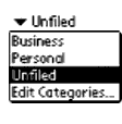
CategorySelect; it shows the popup list of categories and handles editing the categories. Few applications will call CategoryEdit directly.

If you are going to use categories to manage a new database, use CategoryInitialize when the database is created to initialize the AppInfoType structure. You can also use this to set any local category names.
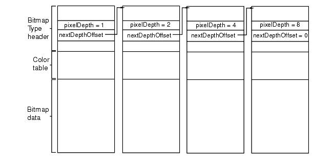
Use CategoryCreateList to create a list of categories. With this function, you can also select whether you want to show the "All" list or hide the "Edit Categories" string. You can use this last option to keep users from changing some category names.

When you create a category list, each category is assigned an unique ID, a memory space is created for the category list, and a pointer of type ListType is set to the list.

The list is sorted with the "All" type first and the uneditable categories at the end. This includes the "Unfiled" category. "Edit Categories" is placed at the end of the list.

Various other functions allow the user to edit and change the category names: CategoryEdit, CategoryFind, CategoryGetName, CategoryGetNext, and CategorySelect.

After the user is done editing and changing the category list CategorySetName writes the renamed categories to the database, CategorySetTriggerLabel marks a category if it is to be truncated, and CategoryTruncateName shortens the name so it will fit the space available.

Finally, CategoryFreeList must be called to deallocate and unlock the memory allocated for the list.

Bitmaps

A bitmap is a graphic displayed by Palm OS. There are several ways to create a bitmap resource in Constructor:

A 'Tbmp' resource defines either a single bitmap or a bitmap family. A bitmap family is a group of bitmaps, each containing the same drawing but at a different pixel depth (see Figure 5.14). When requested to draw a bitmap family, the operating system chooses the version of the bitmap with the pixel depth equal to the display. If such a bitmap doesn't exist, the bitmap with the pixel depth closest to but less than the display depth is chosen. If there are no bitmaps less than the display depth, then the bitmap with the pixel depth closest to the display depth is used.

Programmatically, a bitmap or bitmap family is represented by a BitmapType structure. This structure is simply a header. It is followed by the bitmap data in the same memory block. Bitmaps in Palm OS 3.0 and higher are also allowed to have their own color tables. When a bitmap has its own color table, it is stored between the bitmap header and the bitmap data.

Figure 5.14 Bitmap family

Versions of Bitmap Support

There are three different bitmap encodings:

Drawing a Bitmap

If you use a Form Bitmap object, your bitmap is drawn when the form is drawn. No extra coding is required on your part.

If you're not using a Form Bitmap object, to draw the bitmap you obtain it from the resource database and then call either WinDrawBitmap or WinPaintBitmap. (The form manager code uses WinDrawBitmap to draw Form Bitmap objects.) If passed a bitmap family, these two functions draw the bitmap that has the depth equal to the current draw window depth or the closest depth that is less than the current draw window depth if available, or the closest depth greater than the current draw depth if not.

MemHandle resH =
    DmGetResource (bitmapRsc, rscID);
BitmapType *bitmap = MemHandleLock (resH);
WinPaintBitmap(bitmap, 0, 0);

If you want to modify a bitmap, starting in Palm OS 3.5 you can create the bitmap programmatically with BmpCreate, create an offscreen window wrapper around the bitmap using WinCreateBitmapWindow, set the active window to the new bitmap window, and use the window drawing functions to draw to the bitmap:

BitmapType *bmpP;
WinHandle win;
Err error;

bmpP = BmpCreate(10, 10, 8, NULL, &error);
if (bmpP) {
    win = WinCreateBitmapWindow(bmpP, &error);
    if (win) {
    WinSetDrawWindow(win);
    WinDrawLines(win, ...);
    /* etc */
    }
}

BmpCreate always creates a version 2 bitmap, even if you don't specify a transparency or compression.

To learn how to modify a bitmap in releases prior to Palm OS 3.5, download the Signatures example application from the Knowledge Base on the Palm OS Developer website.

Color Tables and Bitmaps

As mentioned previously, bitmaps can have their own color tables attached to them. A bitmap might have a custom color table if it requires a palette that differs from the default system palettes. If a bitmap has its own color table, the system must create a conversion table to convert the color table of the current draw window before it can draw the bitmap. This conversion is a drain on performance, so using custom color tables with bitmaps is not recommended if performance is critical.

As an alternative, if your bitmap needs a custom palette, use the WinPalette function to change the system palette that is currently in use, then draw your bitmap. After the bitmap is no longer visible, use WinPalette again to set the system palette back to its previous state.

Labels

You can create a label in a form by creating a label resource.

The label resource displays noneditable text or labels on a form (dialog box or full-screen). It's used, for example, to have text appear to the left of a checkbox instead of the right.

You don't interact with a label as a programmatic entity; however, you can use Form and Control API to create new labels or to change labels dynamically. See the "Summary of User Interface API" at the end of this chapter.

Scroll Bars

Palm OS 2.0 and later provides vertical scroll bar support. As a result, you can attach scroll bars to fields, tables, or lists, and the system sends the appropriate events when the end user interacts with the scroll bar (see Figure 5.15).

Figure 5.15 Scroll bar

Here's what you have to do to include a scroll bar in your user interface:

1. Create a scroll bar (tSCL) UI resource.

Provide the ID and the bounds for the scroll bar rectangle. The height has to match the object you want to attach it to. The width should be 7.

2. Provide a minimum and maximum value as well as a page size.

3. Make the scroll bar part of the form.

When you compile your application, the system creates the appropriate scroll bar UI object. (See the chapter "Scroll Bars" in the Palm OS SDK Reference for more information on the scroll bar UI object.)

There are two ways in which the scroll bar and the user interface object that it's attached to need to interact:

Custom UI Objects

A gadget resource lets you implement a custom UI object. The gadget resource contains basic information about the custom gadget, which is useful to the gadget writer for drawing and processing user input.

You interact with gadgets programmatically using the Form API. See the "Summary of User Interface API" at the end of this chapter.

A gadget is best thought of as simply a reserved rectangle at a set location on the form. You must provide all drawing and event handling code. There is no default behavior for a gadget.

Starting in Palm OS 3.5, you can create an extended gadget. An extended gadget is simply a gadget with a callback routine (FormGadgetHandler) that provides drawing and event handling code for the gadget. Use FrmSetGadgetHandler to set the callback function. (A pointer to the gadget is passed to the callback, so you can use the same function for multiple gadgets.) When the form receives certain requests to draw itself, delete itself, or to hide or show a gadget object, the form manager calls the gadget handler function you provide. When the form receives events intended for the gadget, it passes those to the gadget handler function as well.

In versions prior to 3.5, gadgets do not have a callback function. Instead, you must write code to draw the gadget and respond to pen down events in the form's event handler. Listing 5.2 shows the event handler for the main form in the Rock Music sample application. This code makes calls to draw the gadget in response to a frmOpenEvent or frmUpdateEvent, and if there is a penDownEvent within the bounds of the gadget, it calls a function to handle that event as well. Listing 5.3 shows how a gadget handler function might be written for Rock Music.

Listing 5.2 Pre-Palm OS 3.5 gadget example


Boolean MainViewHandleEvent(EventPtr event)
{
    Boolean handled = false;
    Word objIndex;
    FormPtr frm;
    RectangleType r;

    switch (event->eType) {
case frmOpenEvent:
    MainViewInit();
    frm = FrmGetActiveForm ();
    FrmDrawForm (frm);
    DrawGadget();
    handled = true;
    break;
   
    case frmUpdateEvent:
    frm = FrmGetActiveForm ();
    FrmDrawForm (frm);
    DrawGadget();
    handled = true;
    break;
   
    case penDownEvent:
    frm = FrmGetActiveForm ();
    objIndex = FrmGetObjectIndex (frm,
    RockMusicMainInputGadget);
    FrmGetObjectBounds (frm, objIndex, &r);
    if (RctPtInRectangle (event->screenX,
    event->screenY, &r)) {
    GadgetTapped ();
    handled=true;
    }
    break;
    ...
    }


Listing 5.3 Palm OS 3.5 gadget example


Boolean GadgetHandler (struct FormGadgetType *gadgetP, UInt16 cmd, void *paramP)
{
    Boolean handled = false;

    switch (cmd) {
case frmGadgetDrawCmd:
    //Sent to active gadgets any time form is
    //drawn or redrawn.
    DrawGadget();
    gadgetP->attr.visible = true;
    handled = true;
    break;
   
    case formGadgetHandleEventCmd:
    //Sent when form receives a gadget event.
    //paramP points to EventType structure.
    if (paramP->eType == fldGadgetEnterEvent) {
    // penDown in gadget's bounds.
    GadgetTapped ();
    handled = true;
    }
    if (paramP->eType == frmGadgetMiscEvent) {
    //This event is sent by your application
    //when it needs to send info to the gadget
    }
    break;
    case formGadgetDeleteCmd:
    //Perform any cleanup prior to deletion.
    break;
    case formGadgetEraseCmd:
    //FrmHideObject takes care of this if you
    //return false.
    handled = false;
    break;
    }
    return handled;
}


Dynamic UI

Palm OS 3.0 and later provides functions that can be used to create forms and form elements at runtime. Most applications will never need to change any user interface elements at runtime--the built-in applications don't do so, and the Palm user interface guidelines discourage it. The preferred method of having UI objects appear as needed is to create the objects in Constructor and set their usable attributes to false. Then use FrmShowObject and FrmHideObject to make the object appear and disappear as needed.

Some applications, such as forms packages, must create their displays at runtime--it is for applications such as these that the Dynamic UI API is provided. If you're not absolutely sure that you need to change your UI dynamically, don't do it--unexpected changes to an application's interface are likely to confuse or frustrate the end user.

Dynamic user interface objects are subject to the following limitations:

You can use the FrmNewForm function to create new forms dynamically. Palm's UI guidelines encourage you to keep popup dialogs at the bottom of the screen, using the entire screen width. This isn't enforced by the routine, but is strongly encouraged in order to maintain a look and feel that is consistent with the built-in applications.

The FrmNewLabel, FrmNewBitmap, FrmNewGadget, LstNewList, FldNewField and CtlNewControl functions can be used to create new objects on forms.

It is fine to add new items to an active form, but doing so is very likely to move the form structure in memory; therefore, any pointers to the form or to controls on the form might change. Make sure to update any variables or pointers that you are using so that they refer to the form's new memory location, which is returned when you create the object.

The FrmRemoveObject function removes an object from a form. This function doesn't free memory referenced by the object (if any) but it does shrink the form chunk. For best efficiency when removing items from forms, remove items in order of decreasing index values, beginning with the item having the highest index value. When removing items from a form, you need to be mindful of the same concerns as when adding items: the form pointer and pointers to controls on the form may change as a result of any call that moves the form structure in memory.

When creating forms dynamically, or just to make your application more robust, use the FrmValidatePtr function to ensure that your form pointer is valid and the form it points to is valid. This routine can catch lots of bugs for you--use it!

Dynamic User Interface Functions

The following API can be used to create forms dynamically:

Color and Grayscale Support

Starting in Palm OS version 3.5, the operating system supports system palettes of 1, 2, 4, or 8 bits-per-pixel, as follows:

Generalized support for color tables in all bit depths is included, with performance degrading if the color tables are not standard.

Color Table

The system color table is stored in a 'tclt' resource (symbolically named colorTableRsc). The color table is a count of the number of entries, followed by an array of RGBColorType colors. An RGBColorType struct holds 8 bits each of red, green, and blue plus an "extra" byte to hold an index value.

A color's index is used in different ways by different software layers. When querying for a color or doing color fitting, the index holds the index of the closest match to the RGB value in the reference color table. When setting a color in a color table, the index can specify which slot the color should occupy. In some routines, the index is ignored.

Generally, the drawing routines and the operating system use indexed colors rather than RGB. Indexed colors are used for performance reasons; it allows the RGB-to-index translation to be skipped for most drawing operations.

Care should be taken not to confuse a full color table (which includes the count) with an array of RGB color values. Some routines operate on entire color tables, others operate on lists of color entries.

Color Translation Table

When rendering requires a translation from one depth to another, a color translation table is used. For example, suppose you are trying to display an 8-bit color bitmap image on a 2-bit display. Palm OS must translate the color bitmap to a grayscale bitmap in order to display it. To do so, it creates the translation table by stepping through each element of the source color table (the 8-bit bitmap) and finding the best fit for the RGB value in the destination color table (which has exactly 4 values). This table is generated once and is reused for all drawing operations until it is no longer valid.

Palm OS uses one of two algorithms to build the translation table:

Although shortest distance RGB fitting does not always produce the best perceptual match, it is fast, and it works well for the available palettes on Palm OS.

Color Table Management

If you want to change the color table used by the current draw window, you can do so with the WinPalette function. If the current draw window is onscreen, the palette for the display hardware is also changed. For more information see the WinPalette function description in the Palm OS SDK Reference.

If your application needs to know which RGB color corresponds to which index color in the current palette, it can do so with the function calls WinRGBToIndex and WinIndexToRGB. When calling WinRGBToIndex, an exact match may not be available. That is, you may be calling WinRGBToIndex with an RGB value that is not in the palette and thus does not have an index. If there is no exact RGB match, the best-fit algorithm currently in place is used to determine the index value. For WinIndexToRGB, the RGB value returned is always the exact match. (An error is displayed if the index is out of range.)

UI Color List

The system builds a UI color list in addition to the system color table. The UI color list contains the colors used by the various user interface elements. Each UI color is represented by a symbolic color constant. See Table 5.15 for a list of colors used.

Each bit depth has its own list of UI colors, allowing for a different color scheme in monochrome, grayscale, and color modes. This is important because even with a default monochrome look and feel, highlighted field text is black-on-yellow in color and white-on-black in other modes.

To obtain the color list, the system first tries to load it from the synchronized preferences database using the value sysResIDPrefUIColorTableBase plus the current screen depth. The use of a preference allows for the possibility that individual users could customize the look using a third party "personality" or "themes" editor. If the preference is not defined, it loads the default color table from the system color table resource using systemDefaultUIColorsBase plus the current screen depth.

Using a list allows easy variation of the colors of UI elements to either personalize the overall color scheme of a given Palm device or to adjust it within an application. Defining these as color classes ensures that the user interface elements are consistent with each other.

Table 5.15 UI objects and colors 

UI Object Symbolic Colors Used
Forms UIFormFrame, UIFormFill
Modal dialogs UIDialogFrame, UIDialogFill
Alert dialogs UIAlertFrame, UIAlertFill
Buttons (push button, repeating button, check boxes, and selector triggers) UIObjectFrame, UIObjectFill, UIObjectForeground, UIObjectSelectedFill, UIObjectSelectedForeground
Fields UIFieldBackground, UIFieldText, UIFieldTextLines, UIFieldTextHighlightBackground, UIFieldTextHighlightForeground
Menus UIMenuFrame, UIMenuFill, UIMenuForeground, UIMenuSelectedFill, UIMenuSelectedForeground
Tables Uses UIFieldBackground for the background, other colors controlled by the object in the table cell.
Lists and popup triggers UIObjectFrame, UIObjectFill, UIObjectForeground, UIObjectSelectedFill, UIObjectSelectedForeground
Labels Labels on a control and noneditable fields use UIObjectForeground, and text written to a form using WinDrawChars or WinPaintChars use the current text setting in the draw state.
Scroll bars UIObjectFill, UIObjectForeground, UIObjectSelectedFill, UIObjectSelectedForeground
Insertion point UIFieldCaret
Front-end processor (currently only used on Japanese systems) UIFieldFepRawText, UIFieldFepRawBackground, UIFieldFepConvertedText, UIFieldFepConvertedBackground, UIFieldFepUnderline

Should your application need to change the colors used by the UI color list, it can do so with UIColorSetTableEntry. If you need to retrieve a color used, it can do so with UIColorGetTableEntryIndex or UIColorGetTableEntryRGB.

If you change the UI color list, your changes are in effect only while your application is active. The UI color list is reset as soon as control switches to another application. When control switches back to your application, you'll have to call UIColorSetTableEntry again.

Insertion Point

The insertion point is a blinking indicator that shows where text is inserted when users write Graffiti characters or paste clipboard text.

In general, an application doesn't need to be concerned with the insertion point; the Palm OS UI manages the insertion point.

Text

This section describes how to work with text in the user interface--whether it's text the user has entered or text that your application has created to display on the screen.

NOTE:  

If you application is going to be localized, you must take special care when working with text. See the chapter "Localized Applications" for more information.

Working With Text As Strings

The string manager provides a set of string manipulation functions. The string manager API is closely modeled after the standard C string-manipulation functions like strcpy, strcat, etc.

Applications should use the functions built into the string manager instead of the standard C functions because doing so makes the application smaller:

In addition, many standard C functions don't work on the Palm OS device at all because the OS doesn't provide all basic system functions (such as malloc) and doesn't support the subroutine calls used by most standard C functions.

NOTE:  

If your application is going to be localized, be careful when using string functions. Where possible, use the functions described in the chapter "Localized Applications" instead.

Using the StrVPrintF Function

Like the C vsprintf function, the StrVPrintF function is designed to be called by your own function that takes a variable number of arguments and passes them to StrVPrintF for formatting. This section gives a brief overview of how to use StrVPrintF. For more details, refer to vsprintf and the use of the stdarg.h macros in a standard C reference book.

When you call StrVPrintF, you must use the special macros from stdarg.h to access the optional arguments (those specified after the fixed arguments) passed to your function. This is necessary, because when you declare your function that takes an optional number of arguments, you declare it using an ellipsis at the end of the argument list:

MyPrintF(CharPtr s, CharPtr formatStr, ...);

The ellipsis indicates that zero or more optional arguments may be passed to the function following the formatStr argument. Since these optional arguments don't have names, the stdarg.h macros must be used to access them before they can be passed to StrVPrintF.

To use these macros in your function, first declare an args variable as type va_list:

va_list args;

Next, initialize the args variable to point to the optional argument list by using va_start:

va_start(args, formatStr);

Note that the second argument to the va_start macro is the last required argument to your function (last before the optional arguments begin). Now you can pass the args variable as the last parameter to the StrVPrintF function:

StrVPrintF(text, formatStr, args);

When you are finished, invoke the macro va_end before returning from your function:

va_end(args);

Note that the StrPrintF and StrVPrintF functions implement only a subset of the conversion specifications allowed by the ANSI C function vsprintf. See the StrVPrintF function reference for details.

Fonts in Palm OS 3.0 and Later

Palm OS 3.0 and later provides a new font (largeBoldFont), two new font manipulation routines (FontSelect and FntDefineFont), and support for the use of custom fonts.

To use the large, bold font, pass the largeBoldFont selector to the FntSetFont function. Under Palm OS 3.0 and later, if you try to draw with a font that isn't installed, the system uses the standard font by default. Previous versions of Palm OS can crash if told to use a nonexistent font.

The FontSelect function displays a dialog box in which the user can specify the use of one of the three primary fonts stdFont, boldFont, or largeBoldFont. For more information, see the description of FontSelect in the Palm OS SDK Reference.

The FntDefineFont function makes a custom font available to your application. For more information, see the description of FntDefineFont in the Palm OS SDK Reference.

Currently, Palm has not made available any tools or specifications to convert desktop fonts for use on Palm OS 3.0 or later. If you have an urgent need for such support, send email to devsupp@palm.com for updated information.

Receiving User Input

The three main ways that a user interacts with an application are:

The Palm OS provides three managers that control these three types of input: The Graffiti Manager, The Key Manager, and The Pen Manager, respectively.

Most applications do not need to access these managers directly; instead, applications receive events from these managers and respond to the events. There are cases, however, where you might need to interact with one of these managers. This section describes the three input managers and when you might need to use them. (To learn how to obtain user input from a UI object, refer to the section in this chapter that covers that object.)

The Graffiti Manager

The Graffiti manager provides an API to the Palm OS Graffiti recognizer. The recognizer converts pen strokes into key events, which are then fed to an application through the event manager.

Most applications never need to call the Graffiti manager directly because it's automatically called by the event manager whenever it detects pen strokes in the Graffiti area of the digitizer.

Special-purpose applications, such as a Graffiti tutorial, may want to call the Graffiti manager directly to recognize strokes in other areas of the screen or to customize the Graffiti behavior.

Using GrfProcessStroke

GrfProcessStroke is a high-level Graffiti manager call used by the event manager for converting pen strokes into key events. The call

GrfProcessStroke automatically handles Graffiti ShortCuts and calls the user interface as appropriate to display shift indicators in the current window.

An application can call GrfProcessStroke when it receives a penUpEvent from the event manager if it wants to recognize strokes entered into its application area (in addition to the Graffiti area).

Using Other High-Level Graffiti Manager Calls

Other high-level calls provided by the Graffiti manager include routines for

Special-Purpose Graffiti Manager Calls

The remainder of Graffiti manager API routines are for special--purpose use. They are basically all the entry points into the Graffiti recognizer engine and are usually called only by GrfProcessStroke. These special-purpose uses include calls to add pen points to the Graffiti recognizer's stroke buffer, to convert the stroke buffer into a Graffiti glyph ID, and to map a glyph into a string of one or more key strokes.

Accessing Graffiti ShortCuts

Other routines provide access to the Graffiti ShortCuts database. This is a separate database owned and maintained by the Graffiti manager that contains all of the shortcuts. This database is opened by the Graffiti manager when it initializes and stays open even after applications quit.

The only way to modify this database is through the Graffiti manager API. It provides calls for getting a list of all shortcuts, and for adding, editing, and removing shortcuts. The ShortCuts screen of the Preferences application provides a user-interface for modifying this database.

Note on Auto Shifting

The Palm OS 2.0 and later automatically uses an upper-case letter under the following conditions:

This functionality requires no changes by the developer, but should be welcome to the end user.

Note on Graffiti Help

In Palm OS 2.0 and later, applications can pop up Graffiti help by calling SysGraffitiReferenceDialog or by putting a virtual character--graffitiReferenceChr from Chars.h--on the queue.

Graffiti help is also available through the system Edit menu. As a result, any application that includes the system Edit menu allows users to access Graffiti Help that way.

The Key Manager

The key manager manages the hardware buttons on the Palm OS device. It converts hardware button presses into key events and implements auto-repeat of the buttons. Most applications never need to call the key manager directly except to change the key repeat rate or to poll the current state of the keys.

The event manager is the main interface to the keys; it returns a keyDownEvent to an application whenever a button is pressed. Normally, applications are notified of key presses through the event manager. Whenever a hardware button is pressed, the application receives an event through the event manager with the appropriate key code stored in the event record. The state of the hardware buttons can also be queried by applications at any time through the KeyCurrentState function call.

The KeyRates call changes the auto-repeat rate of the hardware buttons. This might be useful to game applications that want to use the hardware buttons for control. The current key repeat rates are stored in the key manager globals and should be restored before the application exits.

The Pen Manager

The pen manager manages the digitizer hardware and converts input from the digitizer into pen coordinates. The Palm Computing Platform device has a built-in digitizer overlaid onto the LCD screen and extending about an inch below the screen. This digitizer is capable of sampling accurately to within 0.35 mm (.0138 in) with up to 50 accurate points/second. When the device is in doze mode, an interrupt is generated when the pen is first brought down on the screen. After a pen down is detected, the system software polls the pen location periodically (every 20 ms) until the pen is again raised.

Most applications never need to call the pen manager directly because any pen activity is automatically returned to the application in the form of events.

Pen coordinates are stored in the pen queue as raw, uncalibrated coordinates. When the system event manager routine for removing pen coordinates from the pen queue is called, it converts the pen coordinate into screen coordinates before returning.

The Preferences application provides a user interface for calibrating the digitizer. It uses the pen manager API to set up the calibration which is then saved into the Preferences database. The pen manager assumes that the digitizer is linear in both the x and y directions; the calibration is therefore a simple matter of adding an offset and scaling the x and y coordinates appropriately.

Application Launcher

The Application Launcher (accessed via the silkscreen "Applications" button) presents a window or menu from which the user can open other applications present on the Palm device. Applications installed on the Palm device (resource databases of type APPL) appear in the Application Launcher automatically.

NOTE:  

Versions of Palm OS prior to 3.0 implemented the Launcher as a popup. The SysAppLauncherDialog function, which provides the API to the old popup launcher, is still present in Palm OS 3.0 for compatibility purposes, but it has not been updated and, in most cases, should not be used.

The Launcher application can beam applications to other Palm devices. Only the application itself is beamed; associated storage databases and preferences are not transmitted. To suppress the beaming of your application by the Launcher, you can set the dmHdrAttrCopyPrevention bit in your database header. (For a runtime code example, see the "Dr McCoy" sample application. Note that you can also use compile-time code to suppress beaming.)

Normally, the Launcher represents installed applications graphically as icons that appear in the Launcher window. The Launcher application also provides a list mode that allows the user to see more applications at once than are normally visible in its default viewing mode. You can use the Constructor tool to provide a small icon for the list mode--you'll need to create a tAIB resource having 1001 as the value of its ID.

The Launcher displays a version string from each application's tver resource, ID 1000. This short string (usually 3 to 6 characters) is displayed in the "Info" dialog.

Situations in which you need to open the Application Launcher programmatically are rare, but the system does provide an API for doing so. To activate the Launcher from within your application, enqueue a keyDownEvent that contains a launchChr, as shown in Listing 5.4.

WARNING!

Do not use the SysUIAppSwitch or SysAppLaunch functions to open the Application Launcher application.

Listing 5.4 Opening the Launcher


EventType newEvent;
newEvent.eType = keyDownEvent;
newEvent.data.keyDown.chr = launchChr;
newEvent.data.keyDown.modifiers = commandKeyMask;

EvtAddEventToQueue (&newEvent);


For information on launching other applications programmatically, see "Launching Applications Programmatically" in the chapter "Application Startup and Stop."

Summary of User Interface API

Progress Manager Functions
PrgHandleEvent
PrgStopDialog
PrgUserCancel
PrgStartDialog
PrgUpdateDialog

Form Functions
Initialization
FrmInitForm
Event Handling
FrmSetEventHandler
FrmHandleEvent
FrmDispatchEvent
Displaying a Form
FrmGotoForm
FrmDrawForm
FrmSetActiveForm
FrmPopupForm
FrmNewForm
Displaying a Modal Dialog
FrmCustomAlert
FrmCustomResponseAlert
FrmAlert
FrmDoDialog
FrmHelp
FrmSaveActiveState
FrmRestoreActiveState
FrmNewGsi
Updating the Display
FrmUpdateForm
FrmShowObject
FrmRemoveObject
FrmReturnToForm
FrmHideObject
FrmUpdateScrollers
Form Attributes
FrmVisible FrmSaveAllForms
Accessing a Form Programmatically
FrmGetActiveForm
FrmGetFirstForm
FrmGetFormPtr
FrmValidatePtr
FrmGetActiveFormID
FrmGetFormId
FrmGetWindowHandle
Accessing Objects Within a Form
FrmGetFocus
FrmGetObjectId
FrmGetObjectType
FrmGetObjectPtr
FrmSetFocus
FrmGetObjectIndex
FrmGetObjectPosition
FrmGetNumberOfObjects
Title and Menu
FrmCopyTitle
FrmPointInTitle
FrmSetMenu
FrmGetTitle
FrmSetTitle
Labels
FrmCopyLabel
FrmGetLabel
FrmSetCategoryLabel
FrmNewLabel
Controls
FrmGetControlValue
FrmGetControlGroupSelection
FrmSetControlValue
FrmSetControlGroupSelection
Gadgets
FrmGetGadgetData
FrmNewGadget
FrmSetGadgetData
FrmSetGadgetHandler
Bitmaps
FrmNewBitmap
Coordinates and Boundaries
FrmGetObjectBounds
FrmSetObjectPosition
FrmSetObjectBounds
FrmGetFormBounds
Removing a Form From the Display
FrmCloseAllForms FrmEraseForm
Releasing a Form's Memory
FrmDeleteForm

Window Functions
Initialization
WinCreateWindow
Making a Window Active
WinSetActiveWindow WinSetDrawWindow
Accessing a Window Programmatically
WinGetActiveWindow
WinGetDisplayWindow
WinValidateHandle
WinGetDrawWindow
WinGetFirstWindow
Offscreen Windows
WinRestoreBits
WinCreateOffscreenWindow
WinSaveBits WinCreateBitmapWindow
Displaying Characters
WinDrawChar
WinInvertChars
WinDrawTruncChars WinPaintChar
WinDrawChars
WinDrawInvertedChars
WinEraseChars
WinPaintChars
Bitmaps
WinDrawBitmap
WinPaintBitmap
WinGetBitmap
Lines
WinDrawLine
WinFillLine
WinEraseLine
WinPaintLines
WinDrawGrayLine
WinInvertLine WinPaintLine
Rectangles
WinDrawRectangle
WinInvertRectangle
WinFillRectangle
WinEraseRectangle
WinDrawGrayRectangleFrame
WinPaintRectangle
WinCopyRectangle
WinDrawRectangleFrame
WinInvertRectangleFrame
WinScrollRectangle
WinEraseRectangleFrame
WinPaintRectangleFrame
Pixels
WinDrawPixel
WinErasePixel
WinGetPixel
WinInvertPixel
WinPaintPixel
WinPaintPixels
Clipping Rectangle
WinGetClip
WinResetClip
WinSetClip
WinClipRectangle
Setting the Drawing State
WinPopDrawState
WinModal
WinSetPattern
WinGetPatternType
WinSetBackColor
WinSetPatternType
WinPushDrawState
WinGetPattern
WinSetUnderlineMode
WinSetDrawMode
WinSetForeColor
WinSetTextColor
Coordinates and Boundaries
WinDisplayToWindowPt
WinGetDisplayExtent
WinSetWindowBounds
WinGetFramesRectangle
WinWindowToDisplayPt
WinGetWindowExtent
WinGetWindowBounds
WinGetWindowFrameRect
Working with the Screen
WinScreenMode WinScreenUnlock WinScreenLock
Removing a Window From the Display
WinEraseWindow
Releasing a Window's Memory
WinDeleteWindow
Working with Colors
WinIndexToRGB
WinRGBToIndex
WinPalette

Control Functions
Displaying a Control
CtlShowControl
CtlSetUsable CtlNewGraphicControl
CtlDrawControl
CtlNewControl CtlNewSliderControl
Control's Value
CtlGetValue CtlGetSliderValues CtlSetValue
Label
CtlSetLabel CtlGetLabel
Enabling/Disabling
CtlSetEnabled
CtlHideControl
CtlEnabled
CtlEraseControl
Event Handling
CtlHandleEvent
Setting up controls
CtlGetSliderValues
CtlSetGraphics
CtlSetSliderValues
Debugging
CtlHitControl CtlValidatePointer

Field Functions
Obtaining User Input
FldGetTextPtr
FldSetDirty
FldGetSelection
FldGetTextHandle
FldDirty
Updating the Display
FldDrawField
FldSetSelection
FldRecalculateField
FldMakeFullyVisible
FldSetBounds
Displaying Text
FldSetTextPtr
Editing Text
FldSetText
FldInsert
FldEraseField
FldSetTextHandle
FldDelete
Cut/Copy/Paste
FldCopy
FldPaste
FldCut
FldUndo
Scrolling
FldScrollField
FldSetScrollPosition
FldGetVisibleLines
FldGetNumberOfBlankLines
FldScrollable
FldGetScrollPosition
FldGetScrollValues
Field Attributes
FldGetAttributes
FldGetFont
FldGetMaxChars
FldSetAttributes
FldSetFont
FldSetMaxChars
FldGetBounds
Text Attributes
FldCalcFieldHeight
FldGetTextAllocatedSize
FldSetTextAllocatedSize
FldGetTextHeight
FldGetTextLength
FldWordWrap
Working With the Insertion Point
FldGetInsPtPosition
FldSetInsertionPoint
FldSetInsPtPosition
Releasing Memory
FldCompactText FldFreeMemory
Event Handling
FldHandleEvent
FldSendHeightChangeNotification
FldSendChangeNotification
Dynamic UI
FldNewField

Menu Functions
MenuDispose
MenuEraseStatus
MenuHandleEvent
MenuSetActiveMenu MenuAddItem MenuCmdBarDisplay
MenuHideItem
MenuDrawMenu
MenuInit
MenuGetActiveMenu
MenuSetActiveMenuRscID MenuCmdBarAddButton
MenuCmdBarGetButtonData
MenuShowItem

Table Functions
Drawing Tables
TblDrawTable
TblSetLoadDataProcedure
TblSetCustomDrawProcedure
Updating the Display
TblRedrawTable
TblReleaseFocus
TblRemoveRow
TblMarkTableInvalid
TblUnhighlightSelection
TblGrabFocus
TblUnhighlightSelection
TblMarkRowInvalid
TblSelectItem
Retrieving Data
TblGetItemPtr
TblFindRowData
TblGetSelection
TblSetSaveDataProcedure
TblGetRowData
TblGetItemInt
TblGetCurrentField
Displaying Data
TblSetItemInt
TblSetItemPtr
TblSetRowData
TblSetItemStyle
TblSetRowID
Retrieving a Row
TblFindRowID TblGetRowID
Table Information
TblEditing
TblGetItemBounds
TblGetNumberOfRows
TblHasScrollBar
TblGetBounds
TblGetLastUsableRow
TblSetBounds
Row Information
TblGetRowHeight
TblRowSelectable
TblRowUsable
TblSetRowStaticHeight
TblSetRowHeight
TblSetRowSelectable
TblSetRowUsable
TblRowInvalid
Masked Records
TblRowMasked
TblSetColumnMasked
TblSetRowMasked
Column Information
TblGetColumnSpacing
TblGetColumnWidth
TblSetColumnUsable
TblSetColumnSpacing
TblSetColumnWidth
TblSetColumnEditIndicator
Removing a Table From the Display
TblEraseTable
Event Handling
TblHandleEvent

Private Record Functions
SecSelectViewStatus SecVerifyPW

List Functions
Displaying a List
LstDrawList
LstPopupList
LstSetDrawFunction
LstNewList
Updating the Display
LstMakeItemVisible
LstSetListChoices
LstSetSelection
LstScrollList
LstSetHeight
LstSetTopItem
LstSetPosition
List Data and Attributes
LstGetNumberOfItems
LstGetSelection
LstGetVisibleItems
LstGetSelectionText
Removing a List From the Display
LstEraseList
Event Handling
LstHandleEvent

Category Functions
CategoryCreateList
CategoryEdit
CategoryFind
CategoryFreeList
CategoryGetName
CategoryGetNext
CategoryInitialize
CategorySelect
CategorySetName
CategorySetTriggerLabel
CategorySelect
CategoryTruncateName

Bitmap Functions
BmpBitsSize
BmpColortableSize
BmpCompress
BmpCreate
BmpDelete
BmpGetBits
BmpGetColortable
BmpSize
ColorTableEntries

Scroll Bar Functions
SclSetScrollBar
SclHandleEvent
SclGetScrollBar
SclDrawScrollBar

UI Color List Functions
UIColorGetTableEntryIndex
UIColorSetTableEntry
UIColorGetTableEntryRGB

UI Controls
UIBrightnessAdjust
UIPickColor
UIContrastAdjust

Insertion Point Functions
InsPtEnable
InsPtGetHeight
InsPtGetLocation
InsPtEnabled
InsPtSetHeight
InsPtSetLocation

String Manager Functions
Length of a String
StrLen
Comparing Strings
StrCompare
StrCaselessCompare
StrNCompare
StrNCaselessCompare
Changing Strings
StrPrintF
StrCat
StrCopy
StrToLower
StrVPrintF
StrNCat
StrNCopy
Searching Strings
StrStr StrChr
Converting
StrAToI
StrIToH
StrIToA
Localized Numbers
StrDelocalizeNumber StrLocalizeNumber

Font Functions
Changing the Font
FontSelect FntSetFont
Accessing the Font Programmatically
FntGetFont FntGetFontPtr
Wrapping Text
FntWordWrap FntWordWrapReverseNLines
String Width
FntCharsInWidth
FntLineWidth
FntCharsWidth
FntWidthToOffset
Character Width
FntAverageCharWidth FntCharWidth
Height
FntCharHeight
FntBaseLine
FntLineHeight
FntDescenderHeight
Scrolling
FntGetScrollValues
Creating a Font
FntDefineFont

Graffiti Manager Functions
Translate a Stroke into Keyboard Events
GrfProcessStroke
Shift State
GrfInitState
GrfCleanState
GrfFindBranch
GrfGetState
GrfSetState
Point Buffer
GrfGetNumPoints
GrfAddPoint
GrfFlushPoints
GrfMatch
GrfGetPoint
GrfFilterPoints
GrfGetGlyphMapping
GrfMatchGlyph
Working with Macros
GrfGetAndExpandMacro
GrfDeleteMacro
GrfGetMacroName
GrfAddMacro
GrfGetMacro

Key Manager Functions
KeyCurrentState
KeySetMask
KeyRates

Pen Manager Functions
PenCalibrate PenResetCalibration


Palm OS Programmer's Companion

  Previous Page Table of Contents Index Next Page  

This is page 74 of 85 in this book

Palm Computing Platform Development Zone
Copyright © 2000, Palm, Inc. All rights reserved.